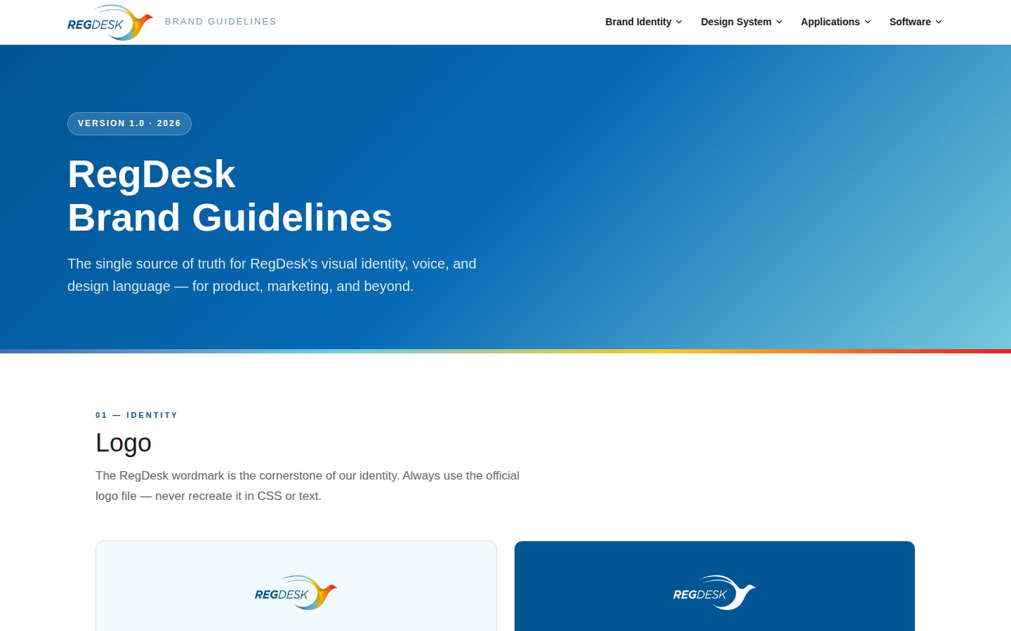
Version 1.0 · 2026

RegDesk
Brand Guidelines

The single source of truth for RegDesk's visual identity, voice, and design language — for product, marketing, and beyond.


Color Palette

Deep navy anchors the brand with authority. Amber adds energy. The signature gradient stripe — blue to amber to red — appears at section edges and as a decorative brand signal.

Navy Blue
#005594
Primary · CTAs · Links
Bright Blue
#035cfa
Interactive · Highlights
Mid Blue
#466ab1
Gradient start · Secondary
Sky Blue
#76cadd
Gradient mid · Light accents
Amber
#fbc624
CTA buttons · Highlights
Red
#e71f20
Gradient end · Urgency
Ice Blue
#f1fafc
Section bg · Cards
Near Black
#1d1c1d
Body text · Primary text
#466ab1 → #76cadd → #fbc624 → #e71f20  ·  Use at section edges, hero bottoms, footer tops

Type System

Fjalla One brings display authority to headlines. Source Sans 3 keeps body copy clean and readable. Together they balance gravitas with clarity.

Display / H1
Fjalla One · 56px · 1.1lh
Regulatory Clarity
Heading / H2
Fjalla One · 40px · 1.2lh
510(k) Submission Ready
Heading / H3
Fjalla One · 28px · 1.3lh
Global Market Access
Body Large
Source Sans 3 · 20px · 1.6lh
RegDesk simplifies the complexity of medical device regulatory compliance — from submission to approval.
Body Default
Source Sans 3 · 16px · 1.7lh
Our AI-powered platform helps manufacturers navigate FDA regulations, track submissions, and manage compliance documentation — all in one place.
Label / Caption
Source Sans 3 · 11px · 700 · 3px LS
Medical Device Compliance

Spacing Scale

Generous spacing keeps RegDesk layouts premium and breathing. Never cram content — white space is a feature.

12px
xs
24px
sm
48px
md
60px
lg
96px
xl
8px
Buttons
12px
Cards / Images
100px
Pills / Tags

UI Components

Consistent components build trust. Use these patterns across product and marketing.

Buttons
CTA Section Style
Ready to simplify compliance?
Start your free trial today.
Feature Card
Compliance Tracking
Monitor every regulatory requirement across all your submissions in real time.
Tag / Badge
510(k) FDA PMA Cleared Deficiency

Icon System

Use Lucide icons exclusively — 2px stroke, 24px grid. Never use emoji as icons in RegDesk product or marketing contexts.

Lab / Device
AI
Document
Global
Compliance
Workflow
Analytics
Fast
Checklist
Deadline
Team
Warning
Navigate
Success
Search
Settings

Footer Wave

The footer wave is a signature full-width decorative element used at the bottom of product screens, login pages, and marketing layouts. It adds visual depth and warmth while echoing the multi-color brand gradient.

RegDesk Footer Wave
Color Flow
Slate / Mid Blue #466ab1
Sky / Teal Blue #76cadd
Amber / Gold #fbc624
Red / Coral #e71f20
Usage Rules
  • Full-width at bottom of page/screen
  • Used on light / white page backgrounds
  • Flows left (blue) → right (amber/red)
  • Do not crop or tile — always full-width
  • Do not use on dark / navy backgrounds
Implementation (HTML/CSS)
/* Position at bottom of page or screen */
.footer-wave {
  position: absolute;  /* or fixed for app shells */
  bottom: 0;
  left: 0;
  width: 100%;
  pointer-events: none;
}

<img class="footer-wave"
  src="footer-wave.png"
  alt=""
  aria-hidden="true">
Live example
The RegDesk login page at demo.regdesk.co uses this wave as the page footer — layered waves creating visual depth with the bird motif colors flowing across the full viewport width.

Merchandise & Event Materials

RegDesk appears at FDA hearings, RAPS congresses, MedTech conferences, and industry trade shows. These guidelines ensure consistent brand presence across all physical touchpoints — from staff apparel to exhibition booths.

Staff Apparel — T-Shirt
T-shirt mockup

Chest center or left-chest  ·  Logo min 8 cm  ·  Gradient stripe on sleeve cuff

✓ Do
  • Use official logo file only
  • White or navy base colors
✗ Don't
  • Stretch or recolor the logo
  • Use unapproved brand colors
Branded Mug
Mug mockup

White ceramic  ·  Full-color logo center  ·  Gradient stripe on rim band

✓ Do
  • White ceramic mug only
  • Full-color logo on side
✗ Don't
  • Place logo on dark mugs
  • Omit the gradient stripe
Conference Poster — A1 / A0
Conference poster mockup

A1 portrait (594×841 mm)  ·  300 dpi for print  ·  CMYK output

✓ Do
  • Navy header + gradient stripe
  • White logo on dark backgrounds
✗ Don't
  • Use unofficial fonts or colors
  • Skip the QR code / URL
Roll-Up Banner — 85×200 cm
Roll-up banner mockup

85×200 cm standard  ·  150 dpi minimum  ·  CMYK for print

✓ Do
  • Bold Fjalla One tagline
  • Always include QR + URL
✗ Don't
  • Crowd with too much text
  • Use color logos on dark bg

Brand Voice

RegDesk speaks with authority, clarity, and optimism. We serve professionals navigating complex systems — so we match their intelligence while reducing their burden.

Do
  • Be direct and confident — "RegDesk clears 510(k)s faster."
  • Use precise, technical language when addressing professionals
  • Lead with benefit, follow with feature
  • Keep sentences short — regulatory readers are busy
  • Express optimism: "compliant faster", "cleared sooner"
Don't
  • Use buzzword soup — "synergistic compliance ecosystem"
  • Be vague — "helps with regulatory stuff"
  • Sound alarming about compliance — confidence, not fear
  • Use emoji in product or formal marketing copy
  • Overclaim — "we guarantee FDA approval"
Authoritative Precise Optimistic Trustworthy Energetic

Dashboard — Infographic Style

Dashboards visualize regulatory intelligence. Infographic-style layouts make complex submission data scannable at a glance. Each screen has ONE primary goal — the amber CTA drives the key action.

RegDesk Dashboard
One Primary CTA
Every screen has a single amber action that represents the user's primary goal — always above the fold and impossible to miss.
Data Before Chrome
Numbers and insights lead. Decoration follows. KPI cards, funnels, and charts make regulatory data tangible — no fluff, no filler.
Status at a Glance
Color-coded chips (green = cleared, red = deficiency, blue = in review) let users understand submission health in under a second.

Data Backend — Minimalist Style

Data management screens strip away decoration. White space, clean tables, and a single highlighted CTA let power users focus on their data. The amber button is the only color — everything else is neutral.

RegDesk Data Backend
Minimal Color
On data-dense screens, color is reserved for meaning — not decoration. Status chips and the amber CTA carry all the color; everything else is neutral gray.
Density + Breathing Room
14px table rows with 12px uppercase headers and generous padding create a tool that feels professional — dense enough to be efficient, spacious enough to be readable.
Amber = The Action
When everything else is gray, amber wins. The + Add Record button stands alone as the visual anchor and primary call-to-action.